
Reports Overview
AgilePlace provides analytic capabilities to help you measure the performance of your process or value stream. This information is valuable in understanding waste or inefficiencies, identifying bottlenecks, and measuring improvements.
To view an individual board's analytics:
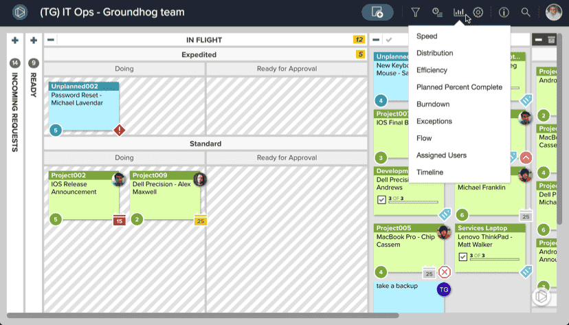
- Click the chart icon in the top menu bar.
- You can choose from a list of available reports from the dropdown menu that appears.
- Select which analytics feature you would like to view.
NOTE
Not all reports shown here will be available in all AgilePlace accounts.
These reports provide the information needed to ensure maximum performance of your process. While on a specific report's screen you can easily access the other reports via the same menu under the chart icon.
Speed
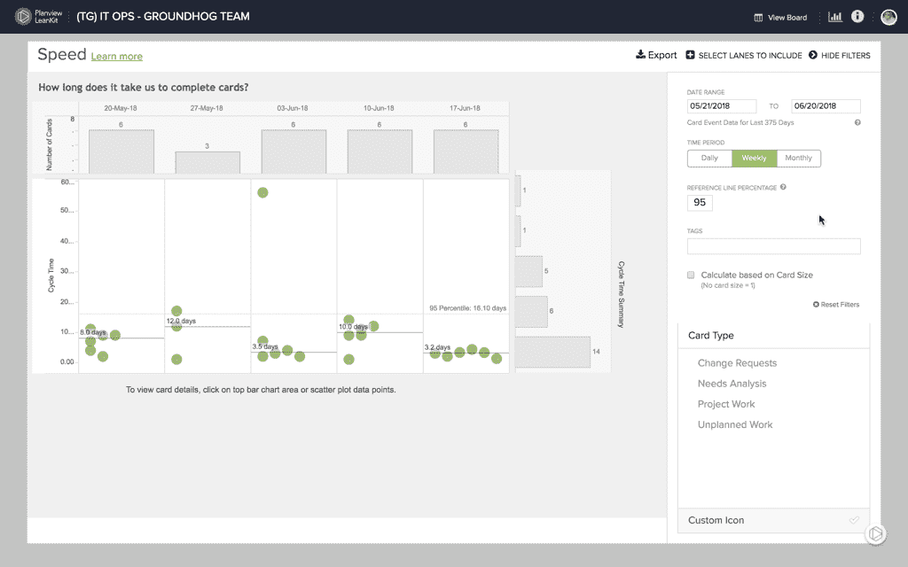
In AgilePlace, the Speed Report shows the average amount of time that a card takes to be processed from a specified start lane(s) to a specified finish lane. It also provides a mechanism for monitoring variability within a system while identifying systems that are "not in control," i.e. not within acceptable limits of variability. This report is generally used to calculate the amount of time that work items take from the time that they enter the work in progress until they are complete.
Cycle Time ("How long does it take us to complete cards?") demonstrates the average amount of time that a work item takes to be processed through the system, i.e. from start to finish. This measurement can be calculated over a given time period to demonstrate increases or decreases in the average amount of time required to process work items. Tracking the average cycle time over a period of time can help you evaluate the effectiveness of system improvements or the detrimental effect of changes to the system like taking on more WIP. Understanding your Cycle/Lead time can also help to provide estimates of future work items.
The Process Control Diagram ("Where do we need to focus our improvement efforts?") demonstrates the variability of cycle times for work items that are moving through your process. This diagram allows you to monitor changes in variability, look for outliers, and drill down into specific cards to investigate root causes.
Calculations of lead and cycle time in the Speed report are based on the start and finish lanes chosen in the lane selector and the date range selected.
How Changes to your Board Layout affect the Speed Report
Effects of Adding New (top level) Lanes:
As new lanes and their associated sub-lanes are added to the board, users will see them in the Speed chart lane selector.
Cards travelling through the lanes will have a record of being there. The data will begin to aggregate for that lane in the Speed chart and over time more historical information will be available.
Effects of Removing Lanes:
As lanes or sub-lanes are deleted, users will no longer be able to select them in the Speed chart lane selector, even if cards being reported on where in those deleted lanes within the dates specified on the report, thus eliminating the data point for a card in that lane.
Effects of Splitting Existing Lanes:
The process of splitting an existing lane into sub-lanes effectively deletes the original lane. It’s not possible to report on data about the original lane anymore, because it is gone. Cards travelling through the new sub-lanes will have a record of having been in those sub-lanes.
Distribution
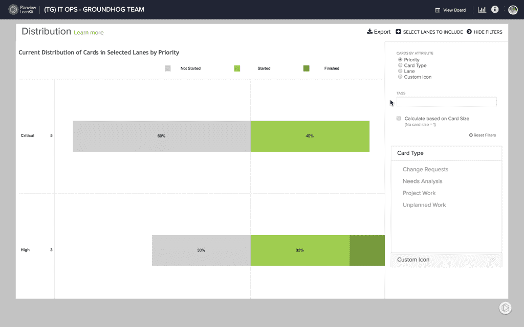
The Distribution Diagram shows the current distribution of cards on the board by lane, priority, type, assigned user, or custom icon. These snapshots provide a quick overview of the how work items are distributed within the system and how much of your capacity is dedicated to different types of work.
How Changes to your Board Layout affect the Distribution Diagrams
Calculation of the count of cards is dependent upon start and finish lanes chosen in lane selector, showing current lanes only. Similar to the Speed report, if a lane had existed sometime in the past, but has been deleted, then the lane will not be available in the Distribution report’s lane selector.
Efficiency
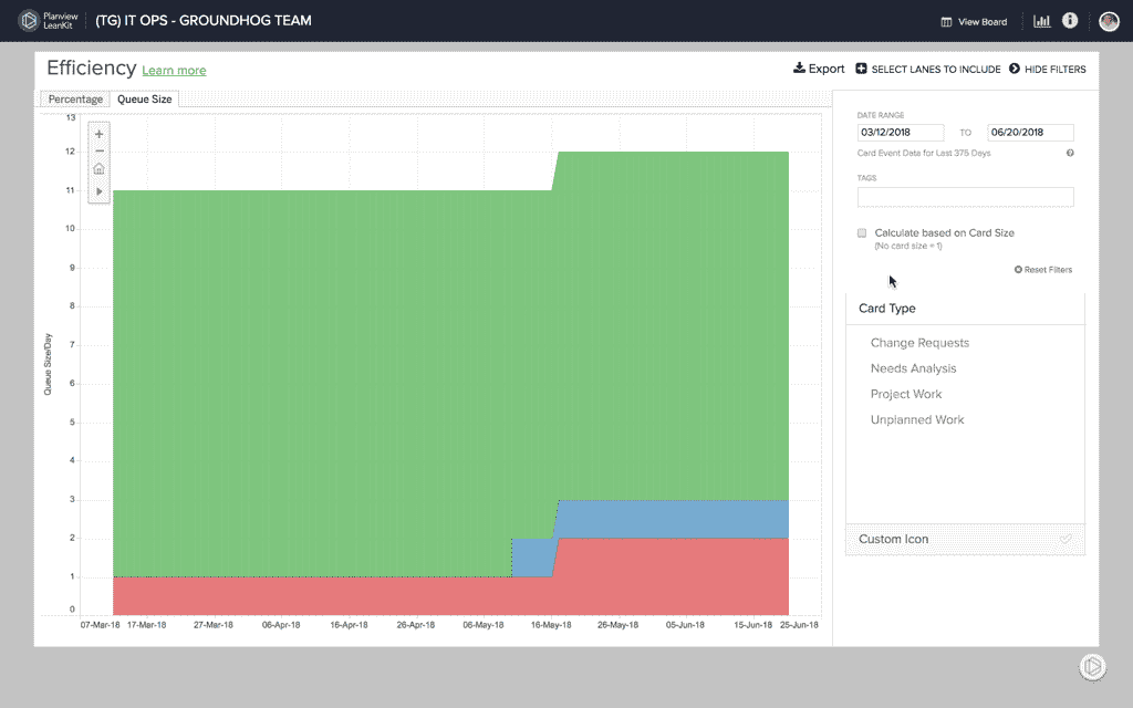
If a card is in your board's Doing lane, that doesn't necessarily mean it's being done. The Efficiency Report helps you to determine the amount of your in-process work that is active or inactive over a specific period of time. Using this report can help you understand which lanes or areas of your board may be inefficient. It can also help you to determine where and how to implement lane WIP limits.
PLANNED PERCENT COMPLETE ("PPC")
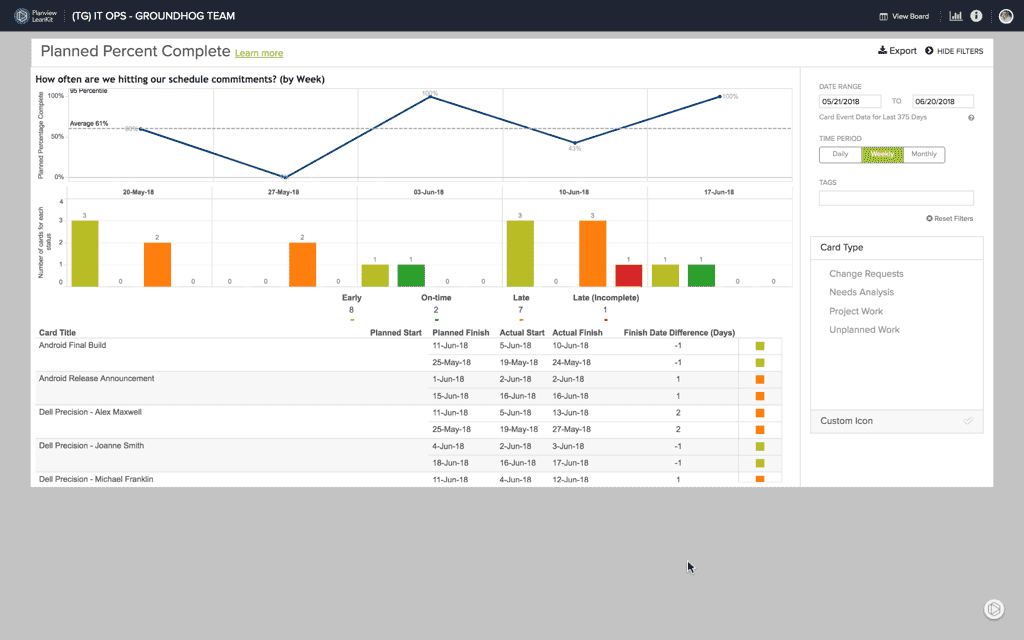
AgilePlace's Planned Percent Complete (PPC) chart compares the planned finish date to the actual finish date to determine whether the item was finished early, on time, or late.
It answers the question, "For the items with a planned finish date of this date, what percentage were completed by the end of this date?"
NOTE
If the cards on your board do not have planned finish dates, the PPC chart is unlikely to prove useful to you.
For each day between the start and end dates, Planned Percentage Complete chart displays the percentage of cards that were completed either early or on time, and plots the trend of these percentages.
It also includes a bar chart, where cards are tallied on their planned finish date and according to whether they were completed early, on time, or late.
The table at the bottom of the report includes all the cards represented in the report, their actual/planned start/finish dates, the number of days off from their planned finish, and the color coded Card Status for each.
How Changes to your Board Layout affect the Planned Percent Complete (PPC) Chart
Calculations in the Planned Percent Complete report are based upon the lanes chosen in the lane selector and the date range selected.
Burndown
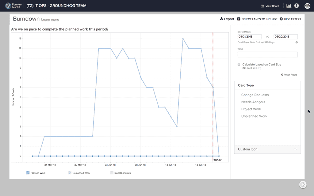
The Burndown chart in AgilePlace helps teams that have a specific amount of work to complete in a specific period of time visualize their progress and answer the question, “Are we on track to complete the planned work by the deadline/end of this iteration/sprint?" It also helps to understand the impact of unplanned work
The Burndown chart classifies included cards as either planned work or unplanned work.
- Planned work is any card that existed in the selected start lane(s) on the selected start date.
- Unplanned work is defined as any card that is added to the start lane(s) after the start date and before the end date.
- The ideal burndown trend is the pace at which planned work would need to be completed in order to complete the planned work by the end date.
How Changes to your Board Layout affect the Burndown Chart
Burndown report calculations are based on the start and finish lanes chosen in the lane selector and the date range selected.
Exceptions
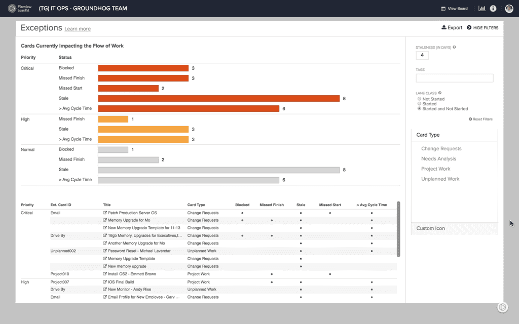
The Exceptions Report in AgilePlace can help team leaders know when to intervene to keep their team’s work on track. The report also helps teams better identify problems and make room for improvement.
What are Exceptions?
Card Statuses
- Blocked work
- Missed start dates
- Missed finish dates
- Stale cards/work
How Changes to your Board Layout affect the Exceptions Report
There is not a lane selector in this report, so edits to the board’s lanes won’t affect the Exceptions report. The card “Start” and “Finish” information is based upon the Actual Start Date and Actual Finish Date.
Flow
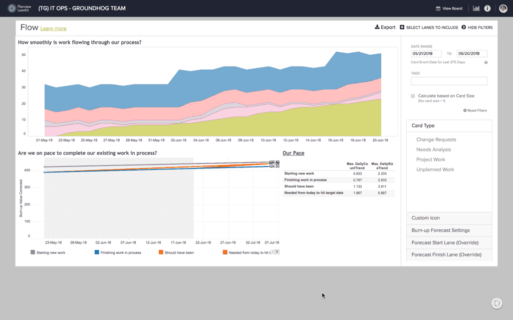
The Flow Diagram shows the relative amount of work in progress for each lane over time. Variations in the width of the colored bands in the chart indicate either more or less work in that lane over time. Widening bands often represent bottleneck situations. The amount of work in process is also a good predictor of the remaining cycle time.
How Changes to your Board Layout affect the Flow Report
Calculations are based on the start and finish lanes chosen in the lane selector and the date range selected.
Assigned Users
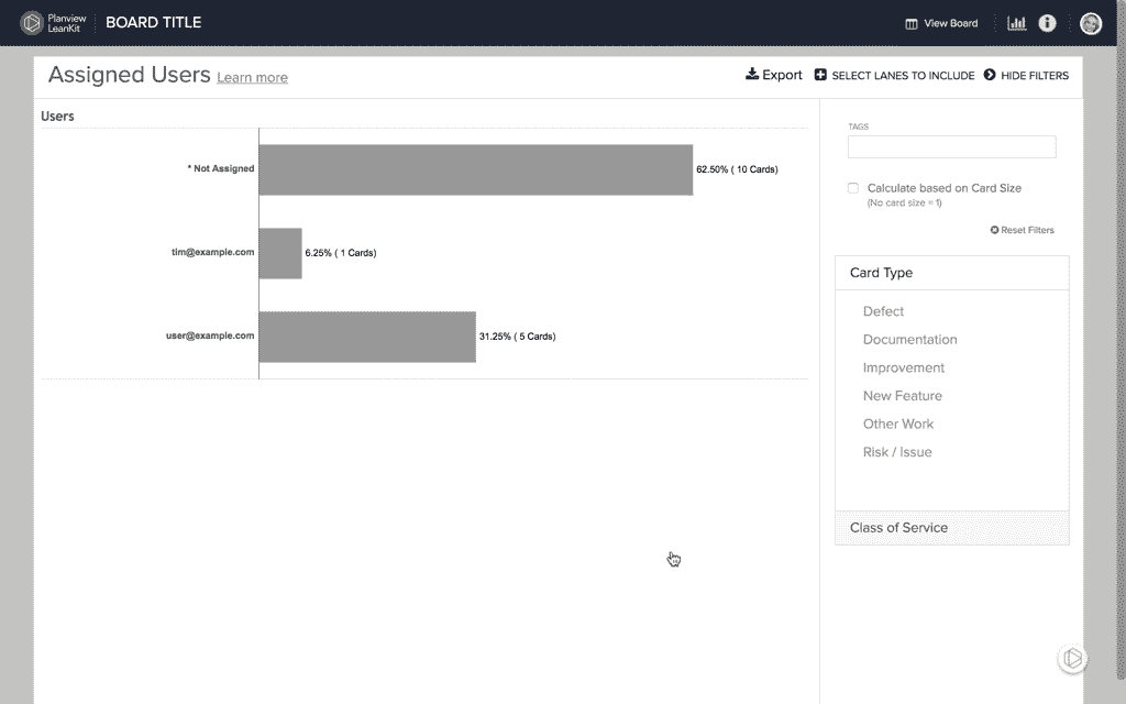
The Assigned Users chart shows the current distribution of cards within a board by assigned user. This allows you to evaluate assigned user information quickly to help determine if work is effectively allocated.
Timeline
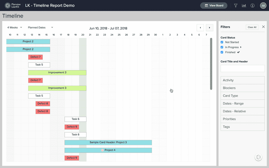
The Timeline report allows you and your team to easily view scheduled work items within your AgilePlace board. The report displays work items spanning from their planned start to their planned finish dates or from their actual start to their actual finish dates.